Ever walked into a store and immediately felt calmer, happier, and ready to browse?
Or the opposite—a store where you couldn’t wait to get out the door?
Whether we realise it or not, the colours used in retail environments have a HUGE impact on our emotions and behaviour as shoppers.
And most retailers don’t even realise the powerful psychology behind colour when it comes to influencing consumers. They slap on some blue or green paint without strategy behind it.
Big mistake.
Colour can make or break a shopping experience.
It can attract customers into your store. It can make them feel comfortable and enjoy browsing. It can even drive key purchasing decisions.
But only if you use colour deliberately and strategically.
That’s where this guide comes in…
In this complete walkthrough, you’ll learn:
- The science behind how colours influence emotions, perceptions, and actions
- How to leverage colour psychology specifically for retail branding and environments
- Practical tips for choosing colours that align with your brand identity and target audience
- Real-world examples of retailers using colour psychology effectively (and tips to avoid ineffective uses!)
With the insights from this guide, you’ll be able to create immersive retail experiences that appeal to customers on a deeper psychological level.
You’ll be able to use the power of colour strategically to attract, engage, and inspire purchasing from shoppers.
Let’s dive in!
Before we get into the retail applications, let’s go over some colour psychology fundamentals.
The basics of colour psychology
Learn More About How Colours Affect the Mind and Body by therapist Amy Morin
This is a particular podcast about how different colours can affect someone’s mind and body. In this episode of The Verywell Mind Podcast, host and therapist Amy Morin discusses how colors can influence our minds and bodies. Listen below to learn more.
Listen to the podcast here: How Colors Affect the Mind and Body
There’s a whole science behind how colours affect us mentally and emotionally.
Some of these effects are cultural—different colours have different meanings across countries. Blue is calming in the U.S., but in Egypt, it’s associated with mourning.
But many colour psychology principles are embedded in our psyche. Like red sparking excitement and appetite. Or green, promoting feelings of peace and healing.
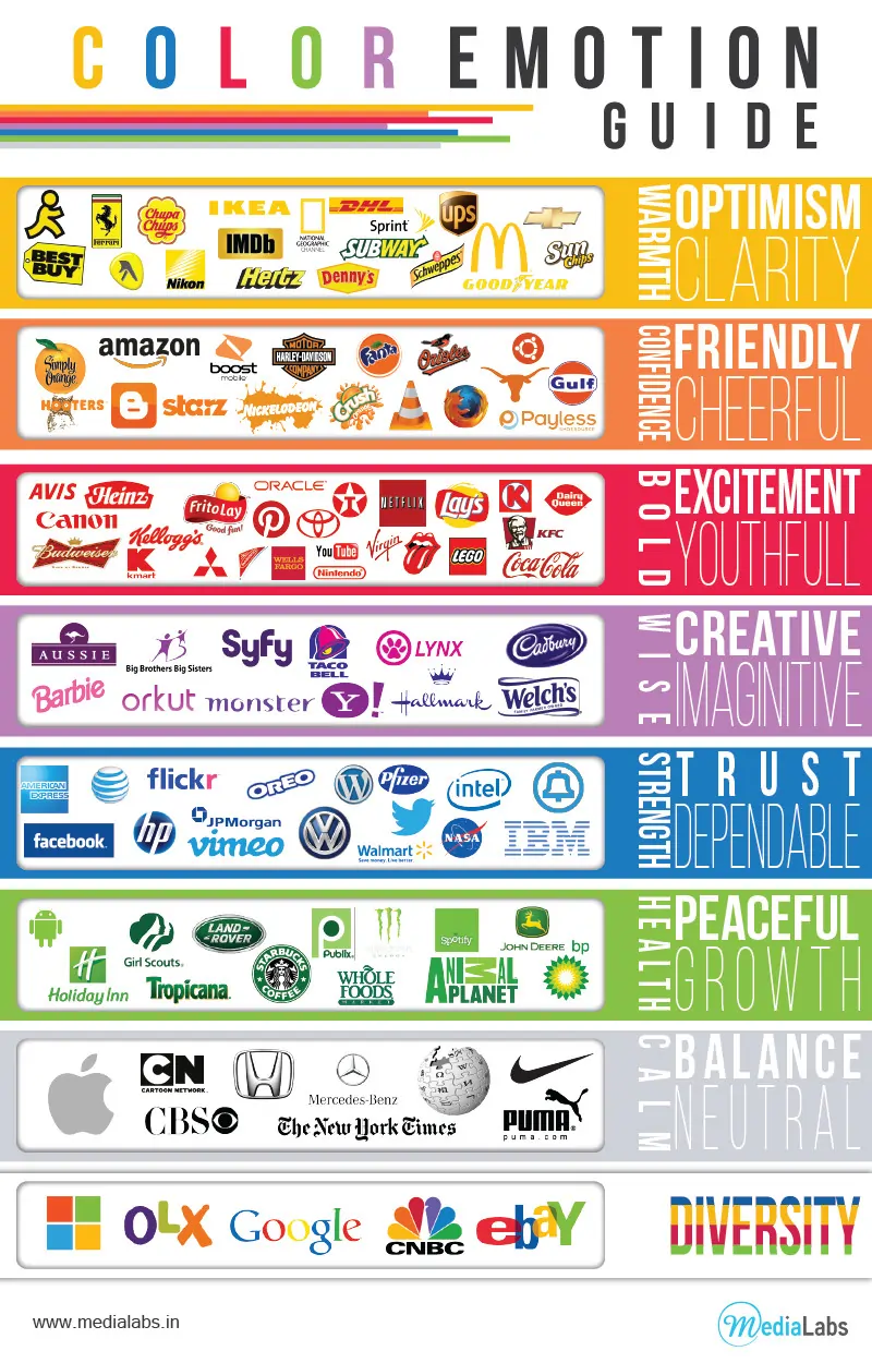
Here’s a quick primer on the emotions and behaviours provoked by major colours:
The colour psychology behind most used colours in Branding Design
Red – Energy, excitement, passion. Can raise blood pressure and appetite. Grabs attention urgently, so great for warnings and danger signals.
Blue – Calm, tranquil, soothing. Lowers blood pressure. Builds trust so commonly used in finance and technology.
Green – Balance, renewal, nature. Promotes harmony in design. Conveys environmentalism and health these days.
Yellow – Cheerfulness, optimism. Grabs attention without the urgency of red. Can promote creativity and mental clarity.
Purple – Luxury, royalty. Associated with creativity and imagination. At high vibrancy can seem sensual or mystical.
Black – Sophistication, elegance. At lower vibrancy can also convey negative emotions like grief or evil.
Orange – Fun, youthful. Associated with affordability. Energising like red but warmer and more inviting.
Pink – Feminine, sweetness, romance. The meaning depends heavily on shade – bold pinks grab attention while softer pinks soothe.
This barely scratches the surface, but you get the idea—colors have an immediate subconscious impact.
And these effects are exponentially stronger when colours are combined strategically. That’s why it’s so important to understand these principles as you plan retail branding and environments.
Let’s now get into the juicy stuff—how to put colour psychology into action for your retail business!
How do you use colour psychology in retail businesses?
Now we get to the fun stuff—how to use colour strategically in retail branding! This is where understanding colour psychology really pays off.
Let’s start with your retail logo and packaging. These are your shopper’s first impression—that subconscious initial reaction to colour.
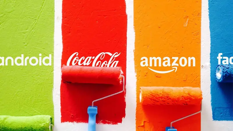
For example, blue is widely used in retail branding because it builds trust. No wonder giant retailers like Facebook, American Express, WordPress, and IBM lean on blue in their logos. Oh, do you remember the colour used by twitter not so long ago? yes, it was blue too.

In fact, brand expert Eleanor Katelaris, from the New Your Post, published a research that shows blue logos perform better than non-blue logos. In the study, Eleanor found that “blue logos dominate the tech industry, accounting for 53% of the total best-performing brand logos in the world.“
“Blue logos reassure customers that a retailer is reliable and stable,” says Zillion Designs in their Meaning and Uses of Colors in Logo Design post. “Blue Represents: Professionalism, Trust, Authority, Power and Loyalty” they stated.
Some other strategic retail logo colours are:
- Green – Whole Foods evokes natural vibes while Starbucks makes you think relaxation.
- Red – Target grabs attention while Netflix stimulates excitement.
- Yellow/Orange – Amazon’s smile logo promotes joy and approachability.
Basically, identify your brand personality and choose logo colours that reinforce it. Bold electric colours for flashy brands, muted earth tones for eco-brands, monochromatic blue for trustworthiness, etc.
This psychology extends to packaging. Cool-toned blues and greens feel more calming and natural for eco-brands. Bright jewel tones signal playfulness on kid’s products.
The key is applying colour strategy, not just personal preference. Now you have the psychological knowledge to make informed colour choices that influence customers as intended!
The best practises when using colour psychology for brick-and-mortar stores
Beyond branding, it’s time to dive into colour psychology for brick-and-mortar store environments.
This is where retailers can truly create immersive experiences by strategically designing the retail space with colour.
Imagine walking into a cool, breezy blue oasis of a store after a long, stressful day. The relaxing blue tones immediately put you at ease. This colour-based atmosphere leads to more browsing and deeper engagement with products.
Now picture entering a bright, sunny yellow boutique. The cheeriness gets you smiling and thinking positively. You feel uplifted browsing the fashionable offerings.
These emotional responses to colour environments are powerful – yet many retailers choose store colours based on what’s available or trendy versus psychological impact.
Here are some research-backed tips for incorporating colour psychology into retail spaces:
- Use blue in high-consideration areas to inspire confidence in purchasing expensive items like jewellery or appliances.
- Paint dressing rooms orange to create an energising environment that promotes purchasing and self-esteem.
- Avoid too much red, which can actually overstimulate and cause shoppers to avoid higher-priced options. Reserve red for sections promoting impulse purchases.
- Add shades of green to spaces like cafes, dressing rooms, and lounge areas to help consumers decompress during the shopping journey.
Playing with colour is also vital for department stores designing the aesthetics of individual brand “shops” within the larger store. For example, black and white for a lux chic brand shop, nautical blues and whites for coastal casual shop, etc. This allows micro-targeting shoppers with strategic colour palettes as they browse.
So, get creative and think about crafting colour environments aligned to your brand identity and customers! You have the power to influence their entire shopping experience.
Using colours in the right way for product displays, signage, and other elements in your store
Let’s shift gears to visual merchandising—how colour is used in product displays, signage, and other in-store elements.
This is where retailers can direct customer attention and influence purchasing behaviour through strategic colour choices.
For example, imagine you’re a home goods retailer interested in selling more kitchen appliances. You want to attract attention to the knife block display.
By using red signage and accents, you immediately draw the eye to those knives. Red’s urgent vibrancy grabs attention. This could increase knife block sales over neutral-colored signs.
Other visual merchandising examples:
- Use black backdrops on jewellery displays to make the precious metals and gems pop.
- Spotlight fitness equipment like treadmills with motivational lime green accents.
- Promote seasonal products like air conditioners or heaters with relevant cool blue and warm red tones.
Cater the colour strategy to the specific product you want to highlight. Is it urgent and needing attention, like a sale item? Choose stimulating, warm shades. Or does it align with relaxation, like massage chairs? Cool, tranquil blues suit that vibe.
This tactic is especially powerful when retailers understand audience demographics and their colour preferences. For example, orange and energetic colours tend to appeal more to bargain hunters and younger shoppers.
So, a discount retailer may use orange prominently in visuals to engage their target audience. Whereas a higher-end store would incorporate more sophisticated black and neutrals.
The psychology here runs deep! Use it to make informed visual merchandising decisions that speak to your products and consumers on a subconscious level.
Using colour psychology on your e-commerce website
Let’s turn our attention to e-commerce—using colour psychology in online retail environments. Digital stores have huge opportunities to leverage colour and watch it impact metrics.
You may be thinking website colour schemes are all about aesthetics. In reality, strategic use of colour can increase conversions, build trust, and keep visitors engaged.

For example, multiple studies show blue website colour palettes perform better thanks to associated feelings of trust and security. Researchers found blue-themed webpages increased consumer confidence by over 20% compared to a control.
“Online stores should leverage the innate trustworthiness of blue,” explains marketing psychologist Dr. Lily Chang. “This is especially important for retailers selling big-ticket items or dealing with sensitive customer data.“
Beyond blue for trust, here are some other psychology-backed e-commerce colour tips:
💡Use green tones on category or product pages promoting relaxation, like spa supplies or gardening tools. Green naturally calms website visitors, to increase time on page.
💡Incorporate energetic red hues on pages with calls-to-action. Red buttons and accents motivate immediate action, essential for add-to-cart buttons. But don’t overdo red or it can feel overwhelming.
💡Test using gender-preferred colours like blue for male-centric pages and purple for female-centric pages. Appeal to different demographics through personalised colour schemes.
💡Focus on the emotions you want site visitors to feel, then choose colours scientifically proven to evoke those reactions. Confidence? Trust? Excitement? You have the power to direct their shopping experience.
The effect of color on conversion rates for men and women
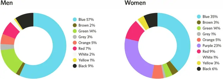
By harnessing the psychology of colour in online retail, you guide visitors seamlessly through the buyer’s journey – attracting, engaging, converting. Don’t leave your colour scheme up to chance. Use it strategically to maximise results.
Now that we’ve covered colour psychology fundamentals and retail applications, let’s discuss some winning examples from major brands. Seeing real-world colour strategies in action brings these lessons to life.
Why major brands succeeded in using colour psychology principles
Target provides an excellent case study in retail logo colour psychology. The prominent red bullseye engages customers with a sense of excitement and action. This builds energy around trips to Target stores and quickly identifies the brand.
Another brand using colour deliberately is Whole Foods. Their green logo and earthy store interiors promote a natural, peaceful shopping experience that aligns with their mission.
Whole Foods stores also leverage warmer accent colours to invite customers to explore. As marketing executive Sonya Gafsi Oblisk notes, “The green say, ‘fresh and organic’ but the woody and orange tones create a welcoming, cosy atmosphere.”
Finally, fast fashion retailer H&M smartly uses colour to appeal to target demographics. Their bright pink bags are eye-catching for younger female shoppers. Display backdrops and signage feature vivid hues that energise their stores.
There are infinite examples of brands, both large and small, effectively applying colour psychology in retail. Use these lessons and best practises as inspiration when crafting your own colour strategies.
Wrapping it up with nice colours!
We’ve covered a lot of ground when it comes to using colour strategically in retail environments. Let’s recap some of the key takeaways:
First, research colour psychology to understand how different hues inherently impact emotions and perceptions. This informs smart colour choices for retail.
Second, match colours to your brand personality and target audience. Seek cohesive experiences versus default palettes.
Third, apply colour expertise across the retail journey—in branding, store environments, merchandising, e-commerce, and more.
Finally, test and iterate colour schemes to see what best resonates with your customers.
This guide just scratched the surface of color psychology applications specifically for retail. Remember, in immersive retail experiences, colour can have an exponentially powerful psychological influence on consumers.
Now you have the insights to start engaging customers on a deeper emotional level through strategic use of colour.
Think about your brand identity and target shoppers. Brainstorm how to translate that into tailored colour strategies that attract, excite, and motivate purchasing across retail touchpoints.
The psychology of colour is endlessly fascinating. Stay tuned for future articles diving into colour psychology applications in other industries and contexts beyond retail!

